Tuesday, October 29, 2013

Episode 82: Headstones & Grave Markers


Oh dearest listeners and savvy blog-goers, it is almost the most magical time of the year, Halloween!  And for this episode, we are bringing you a very special Arts and Facts episode on the world of the graveyard and its fabulous monuments!

Almost nearly all of the information in this episode came from:

Stories in Stone: A Field Guide to Cemetery Symbolism and Iconography by Douglas Keister, thank you Douglas for your wonderful publication!

There are are three basic types of graveyard markers and these are the tumulus, the sarcophagus, and the exedra.

The Tumulus:
 
One of the oldest forms, it is essentially a glorified burial mound. These are most often a build up of rocks with dirt and sod thrown on top to make it look like a hill. Examples of this include the of the tholos “Treasury of Atreus”, the Mycenean burial plot of an ancient king. Once thought to be the tomb of the great king Agamemnon (as has now been proved otherwise), it is still an amazing feat of ancient funerary architecture.


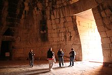
Interior shot of Treasury of Atreus, 1300 BCE, Mycenae
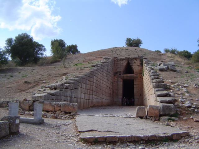
Exterior of Treasury of Mycenae


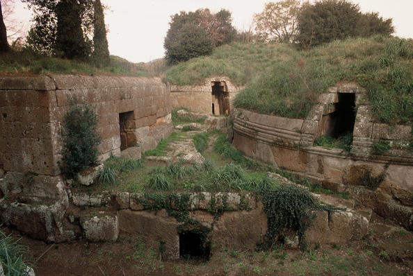
Exterior of Tomb of the Reliefs, Caere at Cerveteri, 5th-4th BCE


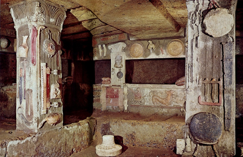
Interior of Tomb of the Reliefs
Elk Tumulus, Greenwood Cemetery in New Orleans, Louisiana, 1912

Alrighty, here is The Sarcophagi (literally body-eating stone, ew!):

These are often structures containing bodies, but they can also be purely ornamental, just demarcating the place over where the coffin actually resides.

Here are probably the coolest sarcophagi ever made. No, really, look at these guys. They get to have the skulls of the losers that they killed on their graves.


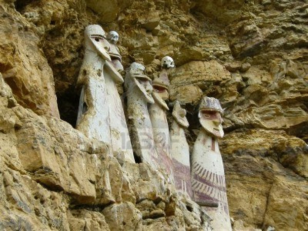
Chachapoyan sarcophagi at Carajia in Peru, 15th century AD


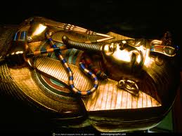
Sarcophagus of Tutankhamun, 1300's BC

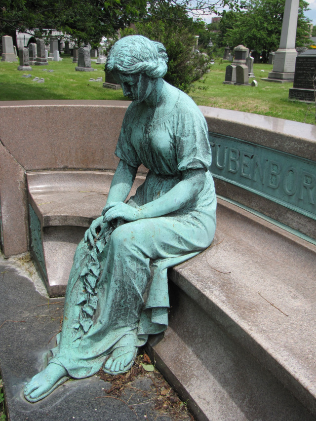
et finalement The Exedra:

Now, the exedra is usually a curved outdoor bench with a high back, whose structure dates back to the ancient Greeks, who knew how to party it up with their dead ancestors!

Many of these modern exedrae feature permanent mourners, like below, that families would have installed so that there was always someone to stay in vigil over their lost loved one. I wouldn't mind a few myself.


Greenwood Cemetery, Brooklyn, New York


Marshall Field Monument, designed and executed by Daniel Chester French and Henry Bacon, Graceland Cemetery at Chicago, Illinois


The Marshall Field Monument was done by the pair that would later create the Lincoln Memorial...hopefully this one doesn't smell of urine like the Lincoln one does. One can only dream!


Now let’s talk about some really weird local funerary artwork. And when I say local, I mean in the United States. We’re shifting gears to good ol’ Kansas, in the city of Hiawatha.


The link above provides some more photos, and an excellent summary of this bizarre gravemarker!


Davis Memorial at Hiawatha, Kansas, 1930-1947


Guys, this is weeeeeird. I’m talking weird on the level that this looks more like a modern art installation than an actual gravesite.


It all started with a guy named John Davis, who in the late 1800’s married an important woman Sarah of the Hart family. The Hart family was very well off, and didn’t like the idea of Sarah marrying a lowly wage-earner like John. However, this didn’t stop the couple, and got married anyways.These two worked hard and brought up their own small fortune from farming and smart investments. Some say that John was abusive to Sarah, not letting her out of the house, and being that controlling type of man that typically no one likes. 

Well, it is easy to see that same OCD attitude of John coming through in the memorial that he had built for Sarah when she passed away in 1930. Sarah, when she died, left a nice chunk a change to her husband, as she didn’t have anyone else to leave it to, and so with 54000 dollars, John put it to good use.

The memorial started out with a simple headstone, but Davis had that removed, and, over the course of the next 17 years until his own death, a memorial grew that was an amalgamation of over 11 statues of John and Sarah throughout their lifetimes represented, with the final figure of John sitting alone with an empty chair sitting beside him, vacant for his lost wife. 

With that, we bring you the last of our Headstones and Grave Markers special. Be sure to sure check out the Davis Memorial in more depth, and tell this cool story to your friends, so you can feel special about your smart self!

Thanks, and have a safe, yet terrifying, Halloween!


Tuesday, October 22, 2013

Episode 81: Milton Glaser


“The act of making things is the path to discovery” -Milton Glaser


Milton Glaser was born in 1929 In New York. He was educated at the High School of Music and Art and Cooper Union Art School in New York. He went to Italy to the Academy of Fine Arts on Fulbright Scholarship. He and some other Cooper Union Graduates started Push Pin Studios in 1954, which is still going strong. "Glaser has been teaching at SVA for over half of a century. He thinks it helps him focus and prevent senility”. (from miltonglaser.com)

He and Walter Bernard (known for designing many magazines and newspapers, such as Time Magazine and the Washington Post) got together to start WBMG, a publication design firm. In 1974 he started his own design firm, MILTON GLASER, INC, which has done many things including creating the famous logo, I [heart] New York. 

Milton Glaser


In 2004 he won a lifetime achievement award from the Cooper Hewitt National Design Museum, which is "Given in recognition of a distinguished individual who has made a profound and long-term contribution to the contemporary practice of design."

President Obama presented Glaser with the National Medal of Arts in 2009. It is the nation's highest honor for artistic excellence. This was the first such award presented to a Graphic Designer. 

“These individuals and organizations show us how many ways art works every day. They represent the breadth and depth of American architecture, design, film, music, performance, theatre, and visual art," said NEA Chairman Rocco Landesman. "This lifetime honor recognizes their exceptional contributions, and I join the President and the country in saluting them." (taken from miltonglaser.com)


In 1977, William S. Doyle, Deputy Commissioner of the New York State Department of Commerce hired advertising agency Wells Rich Greene to develop a marketing campaign for New York State. Doyle also recruited Milton Glaser to work on the campaign. Glaser expected the campaign to last only a couple months and did the work pro bono. It became a major success and has continued to be sold for years. Doyle donated the original concept sketch and presentation board to the Museum of Modern Art in NYC.


After 9/11 the logo became even more of a symbol of NYC. People purchased t-shirts and wore them as a sign of support for the city. Glaser created a modified version of the logo which said, “I {heart} NY More Than Ever” with a black mark at the bottom left of the heart which represented the World Trade Center.
 

Rainbow Room

Milton Glaser, Dylan, 1966, Columbia Records

"The Dylan emerged from two very different conventions. One is the memory echo I had of a silhouette self-portrait that Marcel Duchamps cut out of paper. I remember it very clearly, a simple black and white profile. The convention of Dylan’s hair really emerged from certain forms that intrigued me in Islamic painting...   

...the combination of Duchamps portrait and Near Eastern design elements produced a style some now consider peculiarly American". - taken from Graphic Design by Milton Glaser

New York Magazine was founded by Milton Glaser and Clay Felker in 1968, it is a weekly magazine about culture, politics, life and style. Glaser was president and design director until 1977. It was redesigned in 2004 and is currently under editor-in-chief Adam Moss. While it started out as more of a New York magazine, it is now more of an American magazine. It won Magazine of the Year Award in 2013.

What hasn't this man done? He’s amazing!

Some links:

We'll see you next week for our Halloween episode on Headstones and Grave Markers with Carrie and Lauren


Wednesday, October 16, 2013

Episode 80: French Baroque

This is our third installment in our series “Baroque the Basics”.  Under the “Episodes” tab above you will find the links for #61 Italian Baroque and #64 Northern Baroque.


The French Academy was chartered in 1648.  In 1961 Jean-Baptiste Colbert selected painter Charles Le Brun to be the director of the academy. Modeled after Italian academies, the French Academy sought to train artists in the classical style preferred by the monarchy.  French Baroque painters such as Charles Le Brun, Nicolas Poussin, and Claude Lorrain followed the classical style of Carracci rather than his contemporary Caravaggio.

Seaport with the Embarkation of the Queen of Sheba, 1648

Claude Lorrain


While landscapes were not popular at the time, Lorrain loved them and he pulled his viewers in with themes of heroes, demigods,and saints.
Apollon and the Nymphs,1666-73, marble
François Girardon
Girardon was inspired by Hellenistic sculpture.


Unlike Italy and Spain, where the Catholic Church was the major patron, in France the top patron was Louis XIV, aka the “Sun King”.  
Portrait of Louis XIV, 1661
Charles Le Brun
Louis XIV called Charles Le Brun “the greatest French artist of all time”.
In 1682 the King and his entire court moved 14 miles from Paris to the village of Versailles.  At Versailles life revolved around the king just as the earth revolves around the sun.  He expanded the existing chateau and hunting lodge into a magnificent palace.

"There is nothing that indicates more clearly the magnificence of great princes than their superb palaces and their precious furniture." -- Louis XIV

The baroque style fit the needs of the king perfectly.


Hall of Mirrors


The king’s bedchamber.  Fabulous vases of feathers!


Much of the art at Versailles featured Apollo, alluding to the connection between the god and the Sun King.


Join us next week as our newest podcast member, Zach, joins Julia in talking about graphic designer Milton Glaser!

Wednesday, October 9, 2013

Subscriber Created Banners!

We would like to invite our subscribers to create Arts & Facts Banners to be posted on the blog for a span of two weeks. You can sign it, add your twitter info or website, etc. All mediums welcome there are just a few rules.

1. Must measure 1200 px X 300 px.
2. Must say "Arts & Facts"
3. Keep it family friendly please.
4. Your signature and contact info needs to be no bigger than 11 pts.

So, go crazy! Have fun and lets see what you come up with! You can submit your banner by sending it to us on Facebook or at uvu.artsandfacts@gmail.com.

Tuesday, October 8, 2013

Episode 79: Top 10 Apocalypse Art

Hello hello dearest listeners and blog-goers! Today we present to you our special: Top 10 Apocalypse Art pieces. For those of you who haven't had their Ancient Greek lesson, here's a quick look at what our word comes from:

From Latin apocalypsis, from Ancient Greek ἀποκάλυψις (apokalupsis, “revelation”), from ἀπό (apo, “away”) and καλύπτω (kaluptō, “I cover”).

Alrighty, with that done, let's move to Contestant Number 1:

Kris Kuksi, An Opera for the Apocalypse, 2009

 A piece rife with political, spiritual, and material conflict, this is a beautiful and haunting commentary on our view of the apocalypse.  http://kuksi.com/


Aaaaaaand Number 2:

Michelangelo, Last Judgement, 1537-1541


Alright, if you didn't see this coming, we'd be dissapointed. What strife and expression in this piece, but  espeically lovely is the artist's self-portrait in the skinned figure of St. Bartholomew.

Number 3:

Attrib. to Gislebertus, Last Judgement Tympanum at Autun Cathedrale, France, 1130 CE


Who doesn't like a little judgement now and then? Well certainly not this lot. Take special care to look at this convenient close up we have provided for you, where you can see the Mick Jagger demon on the right.
Mick Jagger look-a-like demon!

 Number 4:

Benjamin West, Death on a Pale Horse, 1817


This man rides on a horse with no name. We'd suggest Gilbert. This was chosen for its delicious violence and mayhem. Look at those gesticulating arms!

Number 5:

Hieronymus Bosch, Last Judgement Triptych, 1482

Was there anyone quite as odd as Bosch? We didn't think so either. This piece was selected for its nightmare inducing demons, and the wonderful progression from light to dark across the painting.

Number 6:

John Martin, The Great Day of His Wrath, 1851-1853

Showing the destruction of Babylon under the wrath of God, this painting will make you a god-fearing soul. This piece was chosen for its wonderful wreckage of a landscape, and the bodies hurtling into the great maw below. Reminds you of Transformers or Star Trek, right?

Number 7:

Joseph M. W. Turner, The Fifth Plague of Egypt, 1800

Although this piece doesn't actually depict the fifth plague of Egypt (it's really seventh, how embarrassing!), it does a great service in its rendering of a destroyed land. We particularly like the fallen corpses in the foreground, it's giving us the spooks as we write this.


Number 8:

Dragons of the Apocalypse, 1377-1382

AREN'T. THEY. CUTE? This has to be the most adorable apocalypse image up to date. Aside from its innate charming factor, we chose this because it has simply lasted so long. It survived being cut up, frost, and, worst of all, horse stables.

Number 9:

John Hendrix, Doomsday from Disasters

Chosen for its awesome combination of text and illustrative technique. And who doesn't love the bird? http://drawnhendrix.tumblr.com/

Number 10:

Tibor Kovacs, Riders of the Apocalypse

Haunting, and yet also something endearing, this piece marks our final selection! http://www.kovacsart.hu/#p=main

Leave your thoughts and comments! Do you know of any better apocalytic images? Leave them in your comments below! Muchas gracias!

Tune in next week when Chloe and Carrie discuss French Baroque!


Tuesday, October 1, 2013

Episode 78: Edward Hopper


Edward Hopper was thought to be the quintessential American realist painter. Born in 1882 in Nyach, New York, Hopper got an early start making art. By his teens, Hopper was experimenting with charcoal, watercolor, pen and ink and oil.

In 1905 hopper got a job creating magazine cover designs but hated it. He traveled to Europe to find his muse and was not impressed with many of the up and coming artists, however he was very impressed with the workings of Rembrandt and would be greatly influenced by his work.


 Automat, 1927

There is something so mysterious about this painting. Why is the girl sitting alone in the cafe? What is her expression telling us? Is she so lonely that she is inviting the viewer into the scene? 


Nighthawks, 1942

His trademark dark palate and urban scenes defined his realist style and he spent much of his time depicting cafe and street scenes in New York City.

 House by the Railroad, 1925

This house was the inspiration for the look of the Bates House in Alfred Hitchcock's film Psycho. This image captures the sense of abandonment and loss that progress can leave in a once peaceful agrarian society.


 New York Movie, 1939

Hopper loved the movies and based this movie theater on one's he frequented in New York City. The lonely usher is based on his wife Jo. Most of the women in his paintings were based on her. 

Edward hopper was thought of as the quintessential realist painter for good reason. His realistic paintings create such emotions for the viewer; and he offers a glimpse into his inner thoughts and feelings.

“Great art is the outward expression of an inner life in the artist, and this inner life will result in his personal vision of the world. ” -Edward Hopper

What are your thoughts about Edward Hopper? Do you sense the loneliness that is so frequently portrayed in his work, or do you think he was attempting to capture moments of silence so rare in a city like New York?

For more information on Edward Hopper you can go here.

Tune in next week when Carrie and Lauren rank the top 10 pieces of Apocalypse Art!